Qt Quick开发教程4:设计规则与流程
QML支持的函数:
- Math.round(5*1.3),Qt.quit(),qsTr(“myButton”),console.log("hello"),Screen.width,
- Image类中: 使用变量progress查询加载进度; 变量Image.status(值为ready表示图片已加载);
QML界面设计规则
一般顶层的Rectangle的ID为root; .qmlproject可以设置QML文件,JS文件及图片文件的目录
QML 的窗体界面设计如下:
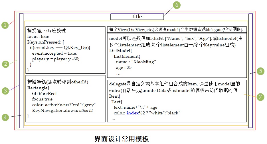
下面对其中的内容进行详细介绍:
Window :window: 主窗体- 属性
W:640 H:480 - 方法
onCompleted,window创建完成时会调用,如window.showMaximized.
- 属性
ScrollView:mainView: 主窗体的视图格式,可以是ScrollView,Stacked View,Flickable.- 属性
W:1.W H:1.H
- 属性
Item:mainContent:- 属性
W:1.W H:6.H+7.H+200
- 属性
Item:leftMargin:- 属性
W:3.marginWidth
- 属性
Item:rightMargin:- 属性
W:3.marginWidth
- 属性
Text:header:- 属性
W:contentWidth,H:contentHeight,text,color,font,Anchors{top,bottom,horizontalCenter}
- 属性
Column:mainLayout:- 属性
Anchors{top,topMargin,left,right},spacing - 其他
Grid:subLayout,spacing,columns
- 属性
import QtQuick 2.12
import QtQuick.Window 2.12
import QtQuick.Controls 2.14
import "flatui" as Flat //import the ui library

//Platform  Title1  Title2  NromalText  marginWidth spacing        Screen.Size
//Win       50      30      18          100         50             1920*1080
//Android   30      24      16          5           30             ****
//层次如下: Window >> Flickable/ScrollView >> Item(mainContent) >> header+leftMargin+rightMargin+Column(mainLayout)
//mainLayout中尽量只使用Flow布局和Column布局,如果需要使用Row布局,其中尽可能只包含一个Child,避免安卓上的不适配

Window {
    id: window
    visible: true
    width: 680
    height: 480

    property int title1Size: (Qt.platform.os == "android")?30:50
    property int title2Size: (Qt.platform.os == "android")?24:30
    property int normalTextSize: (Qt.platform.os == "android")?16:18
    property int spacingSize: (Qt.platform.os == "android")?30:50

    Flickable{
        width: mainContent.width
        height: window.height
        contentHeight: mainContent.height
        contentWidth: Math.min(window.width,Screen.width)

        Item {
            id: mainContent
            width: Math.min(window.width,Screen.width)
            height: header.height + mainLayout.height + 200

            readonly property int marginWidth: (Qt.platform.os == "android")?5:100
            Item {
                id: leftMargin
                anchors.left: parent.left
                anchors.top: parent.top
                anchors.bottom: parent.bottom
                width: parent.marginWidth
            }

            Item {
                id: rightMargin
                anchors.right: parent.right
                anchors.top: parent.top
                anchors.bottom: parent.bottom
                width: parent.marginWidth
            }

            Text {
                id: header
                anchors.horizontalCenter: parent.horizontalCenter
                anchors.top: parent.top
                anchors.bottomMargin: 10

                text: "Flat UI"
                width: contentWidth
                height: contentHeight
                color: Flat.FlatUI.midnightBlue
                font {
                    family: Flat.FlatUI.latoBlackFont.name
                    bold: true
                    pointSize: window.title1Size
                }
            }

            Column {
                id: mainLayout
                anchors.top: header.bottom
                anchors.topMargin: 30
                anchors.left: leftMargin.right
                anchors.right: rightMargin.left
                spacing: window.spacingSize

                Text {
                    text: "Basic elements"
                    width: contentWidth
                    height: contentHeight
                    color: Flat.FlatUI.midnightBlue
                    font {
                        family: Flat.FlatUI.latoRegularFont.name
                        bold: true
                        pointSize: window.title2Size
                    }
                }

                Text {
                    text: "Buttons"
                    width: contentWidth
                    height: contentHeight
                    color: Flat.FlatUI.midnightBlue
                    font {
                        family: Flat.FlatUI.latoRegularFont.name
                        bold: true
                        pointSize: window.normalTextSize
                    }
                }

                //Flow's Usage: Must Specify the width so that it can wrap.
                Flow{
                    layoutDirection: Qt.LeftToRight
                    spacing: window.spacingSize
                    width: parent.width
                    //flow:  width > height ? GridLayout.LeftToRight : GridLayout.TopToBottom

                    Flat.PrimaryButton {
                        text: "FileDialog"
                    }
                    Flat.PrimaryButton{}
                }
            }
        }
    }
}
常用的控件类及其属性、信号、方法等
- Anchors includes:
top,topMargin,horizontalCenter - Text includes:id,
text,anchors,font.pixelSize,horizontalAlignment,color - TextInput includes:
id,anchors,onAccepted,text,font.pixelSize,horizontalAlignment,color - MouseArea includes:
id,anchors,onClicked(,hoverEntered)(,onEntered)(,onExited) - Rectangle includes:
id,width,height,color(,x)(,y)(,anchors)(border.color)(border.width)(radius)(,Text)(,MouseArea) - Image includes:
id,source,sourceSize.height,sourceSize.width,anchors,onProgressChanged,onStatusChanged(,Text)(,MouseArea) - AnimatedImage includes:
id,source,(x),(y),anchors,onProgressChanged,onStatusChanged(,Text)(,MouseArea) - Flickable(滚动条) includes:
id,width,height(滚动区域),contentWidth,contentHeight(要滚动的内容),contentY(当前显示内容相对于Flickable区域左上角的Y offset值), 垂直滚动的设置: Math.min(contentHeight-height, Math.max(0,player.y-height/2))),boundsBehavior: Flickable.StopAtBounds,interactive: true
Item的所有子类:AnimatedSprite,BorderImage,Canvas,Column,ColumnLayout,Flickable,Flipable,Flow,FocusScope,Grid,GridLayout,Image,Loader,MouseArea,MultiPointTouchArea,ParticlePainter,PathView,PinchArea,Rectangle,Repeater,Row,RowLayout,ShaderEffect,ShaderEffectSource,Shape,SignalSpy,SpriteSequence,StackLayout,TestCase,Text,TextEdit, andTextInput.
自定义控件类
自定义Item includes: 先定义属性(property bool/string/int/double [属性名]:初始值),信号(signal buttonClicked,使用时直接buttonClicked()即触发信号), 再实例化内部需要的其他控件.
使用自定义Item: 控件类名(=自定义Item所在文件名){… 设置属性…,… 实现槽函数onButtonClicked:{console.log(“I’m slot”)} }
快速例化
Repeater类:包含一个model和一个delegate,model常为数值(例如5),delegate可以是任意Item类. Repeater一般被包含在Row,Column,Grid类的实例中,生成一行/列/框相类似的Item.
其他Trick
- 系统窗口的渐变色
gradient: Gradient{GradientStop{position:0.9;color:Qt.darker(palette.window, 1.8)} SystemPalette使用系统自带配色Loader加载页面(*.qml),Timer定时器,并行动画ParallelAnimation,顺序动画SequentialAnimationXmlListModel使用互联网API生成线性Model
(属性title和pubDate可直接被View访问)
  import QtQuick 2.0
  import QtQuick.XmlListModel 2.0
  XmlListModel {
      id: xmlModel
      source: "http://www.mysite.com/feed.xml"
      query: "/rss/channel/item"
      XmlRole { name: "title"; query: "title/string()" }
      XmlRole { name: "pubDate"; query: "pubDate/string()" }
  }